A guest decides whether they love a hotel in the first fifteen seconds after they walk into the lobby. It’s not a conscious decision. What happens is that they clock the light, the smell, the sound of the floor under their shoes, and the attention of the person behind the desk. Some part of their body relaxes, or it doesn’t. The rest of the stay is mostly a process of confirming that first decision.
The entire business of a boutique hotel is producing those first fifteen seconds, on purpose, for every guest who walks in. Everything else — the room category, the breakfast menu, the concierge, the thread count — matters, but only after that first moment has already done its work. Hotels that understand this build their entire operation around protecting those fifteen seconds. Hotels that do not, compete on price.
Which is why it’s strange that so much of the marketing that leads a guest to the hotel in the first place is doing the opposite of what the lobby does.
The photography on the booking site shows the room from a wide angle, evenly lit, stripped of all atmosphere. The Instagram feed rotates between staff photos and sunset reels. And the website header is a drone shot of the building from across the valley. Nowhere in any of it can you find what the hotel is actually selling, which is a specific quality of feeling that begins in the lobby and carries through the stay. A prospective guest scrolls through the marketing and understands what the property is, but not what it feels like. The lobby is doing one job and the marketing is doing a different one, and that disconnect leaks trust every time.
This is the problem illustration is meant to solve, and the reason it has quietly become the difference between hospitality brands that punch above their weight and those that do not.
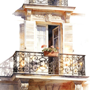
An illustration can do something a photograph structurally cannot, which is show a viewer a feeling instead of a fact. A photograph of a breakfast table tells you that there is a breakfast table and documents its contents. A painterly illustration of a breakfast table tells you what it would feel like to sit down there: morning light bleeding into the corners of the image, linen suggested rather than rendered. The first is information. The second is an invitation. For a hotel, which wants to sell the customer on that feeling, the second is doing the actual work.
But not all illustration does this. Most of it, honestly, does not. The illustration industry is full of work that is technically skilled and emotionally dead — tight, literal renderings of buildings that tell you exactly what the property looks like, which you already know because you’ve seen the photos. A good illustration does not compete with the photography. It reaches places that the photos cannot go.
The way to tell the difference, if you are looking at a portfolio or a library, is to ask a question that feels almost too simple to be useful: after looking at this image for thirty seconds, do I want to be there? Not is it beautiful. Not is it well-crafted. Not does it match the property. Do I want to be inside it. If the answer is not immediate and physical, the image is simply decoration. If it is, the image is doing the work.
The second thing to understand, once you’ve found an illustration that actually evokes rather than describes, is that a single good image does not make a brand. This is the part that most hotels misunderstand, and it can cost them for years. They commission one illustration they love. They use it in a campaign. The campaign performs, so they commission another from someone else a year later, in a slightly different style, and use it somewhere else. Then a third illustration from another artist. None of the pieces are bad. None of them are wrong. But none of them belong together, and a guest who encounters all three over the course of planning a trip does not experience a coherent brand. They experience a competent hotel with inconsistent design, which is a very different thing.
What builds a boutique hotel’s visual identity is not individual images. It is the pattern a guest recognizes across them. The palette holds from the website to the room to the Instagram post. The light is always a particular kind of light. The subjects the eye keeps returning to — a clawfoot tub, a set table, an empty garden chair, hands pouring wine — add up to a consistent sensibility, and that sensibility is what the guest means when they say the brand “has a soul.” They are not describing magic. They are describing consistency of attention.
Which means the practical question, when a hotel is choosing illustration, is not do I love this one image. It is could this eye make fifty more like it, and would the fiftieth still belong with the first. If the answer is not obviously yes, what the hotel is looking at is a commission, not a visual system, and a commission will not survive the hotel’s growth. Properties refresh. Sister locations open. Campaigns roll out in new seasons. The question is whether the illustration the hotel chooses today can go where the hotel is going tomorrow, or whether it stops at the edge of whatever the original artist happened to paint.
This is why the hotels that take their visual identity seriously have quietly moved away from commissioning individual artists toward licensing from documented visual libraries built by one artist with enough range to cover a property’s whole world. A library like that has already done the work of coherence. The palette is set. The light is consistent. The subjects have been thought through as a system rather than collected one at a time. When the hotel needs a new illustration for a new campaign, the work extends from the existing language rather than starting over. Everything compounds.
That is the difference, in the end, between illustration that carries a hotel brand for a decade and illustration that looks dated in eighteen months. Not style. Not technique. Not budget. It is whether the illustration is part of a visual system built by one consistent eye, or a collection of individually nice pieces that do not quite add up to a world.
The Monnaco Collection is a library of watercolor-inspired illustrations built inside a single sensibility, made by one artist, designed from the start to function as a visual system. Boutique hotels license from what exists and commission work that extends the library into their specific world — usually both. If any of what this article has been circling feels true about your own brand, that is probably a conversation worth having.
— Ana